Nutnut
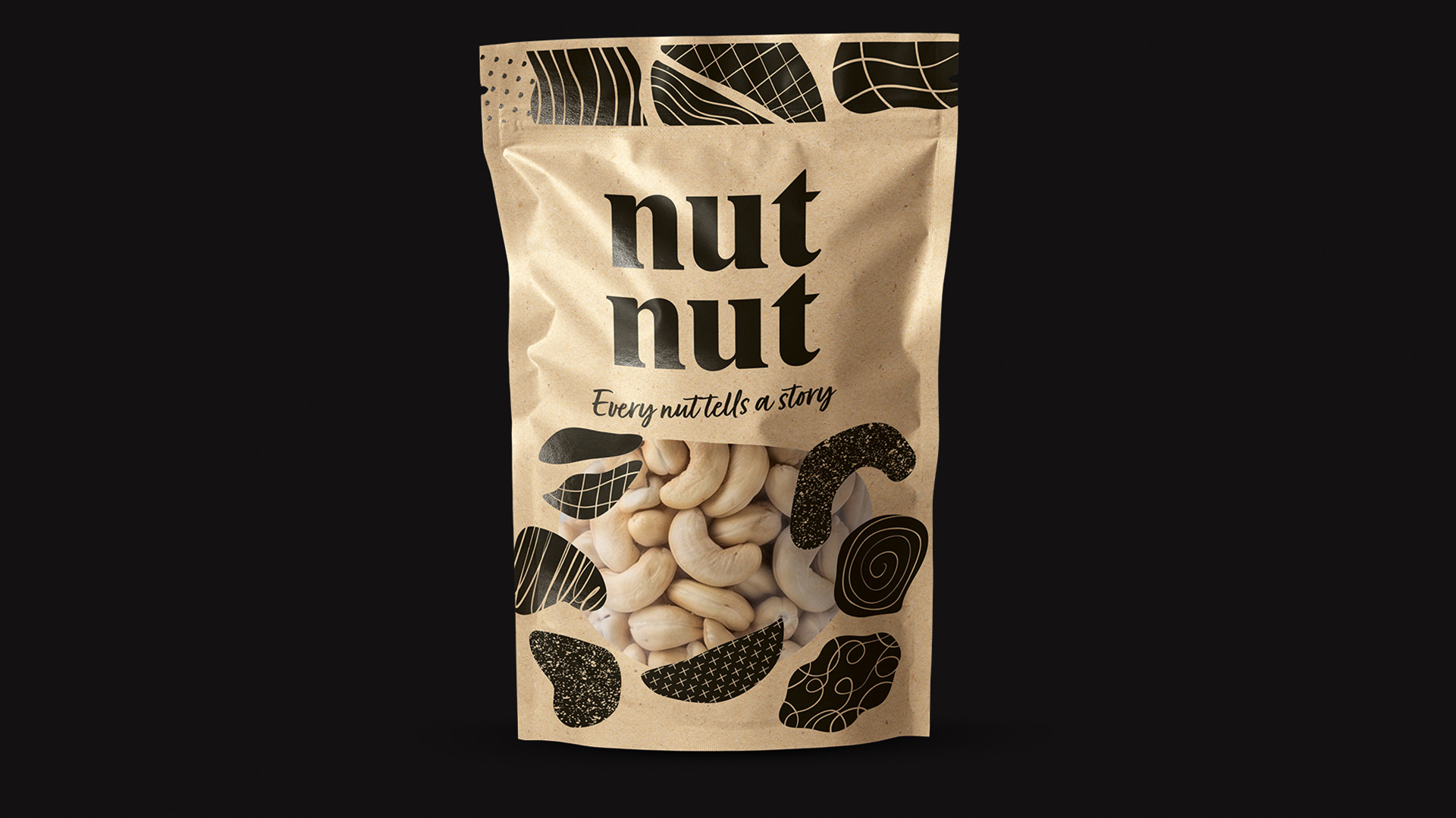
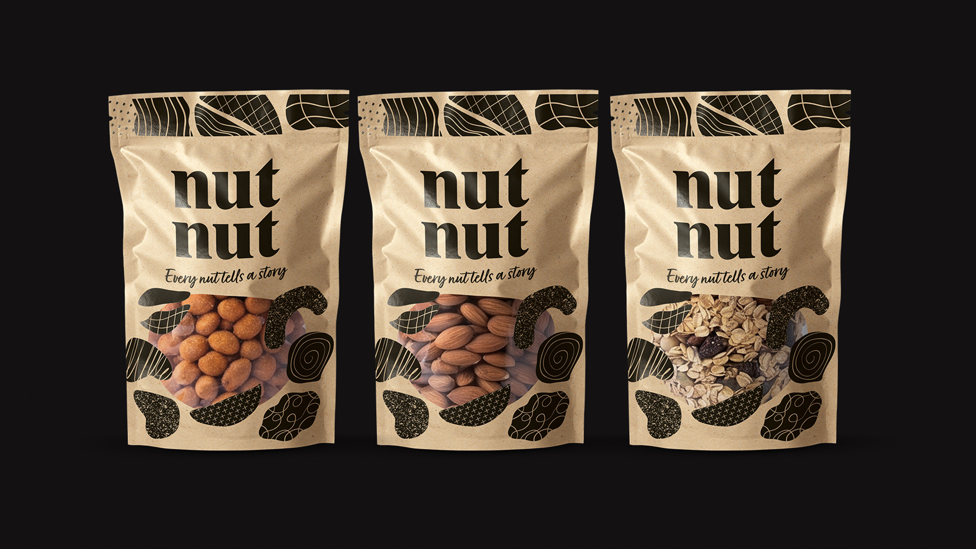
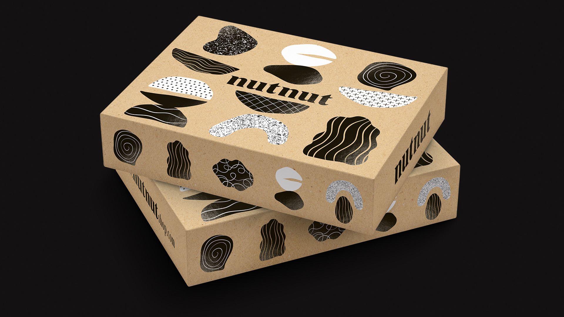
The aim of the project was to revitalise the brand identity and packaging design for a nut retailer, while preserving the familiarity customers already associated with the brand. Although the previous packaging served its purpose, it had become visually outdated and lacked the flexibility needed to support a growing brand. Our solution focused on creating a distinctive visual language built around abstract shapes inspired by nuts. These organic forms give the brand a more contemporary and playful character, while providing a versatile graphic system that can be applied consistently across future packaging, communications and customer touchpoints.
This design was created for the brand’s bulk product range, sold exclusively in its own stores. More than standalone packaging designs, they represent the foundation of a flexible identity system that allows the brand to evolve while remaining instantly recognisable.