Añoranza
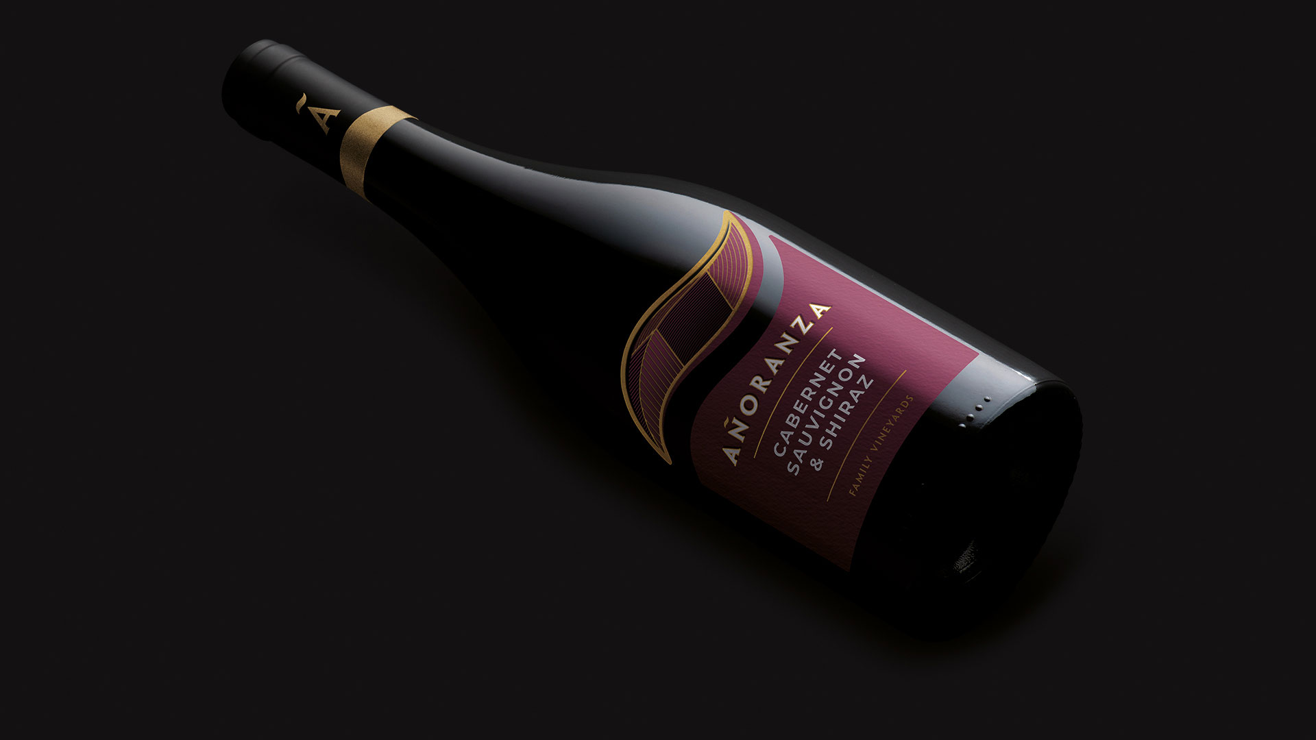
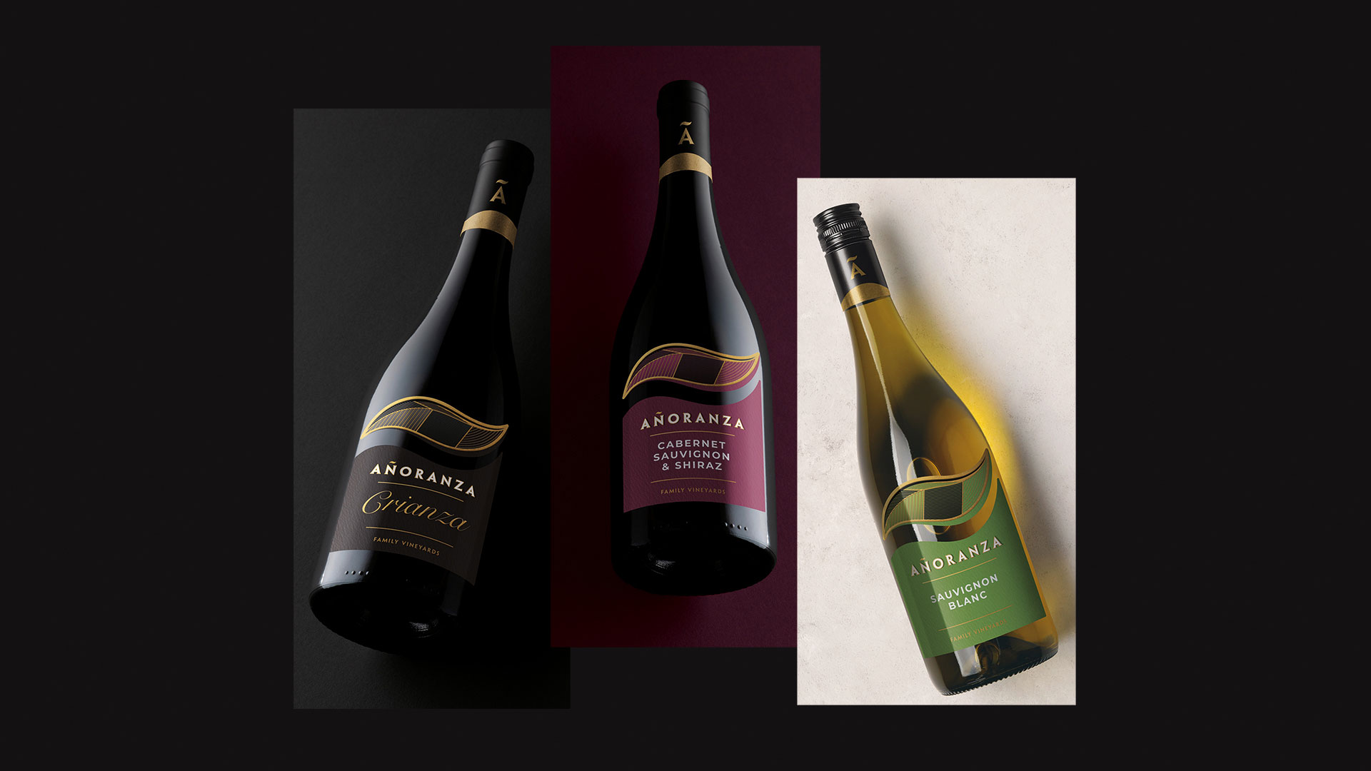
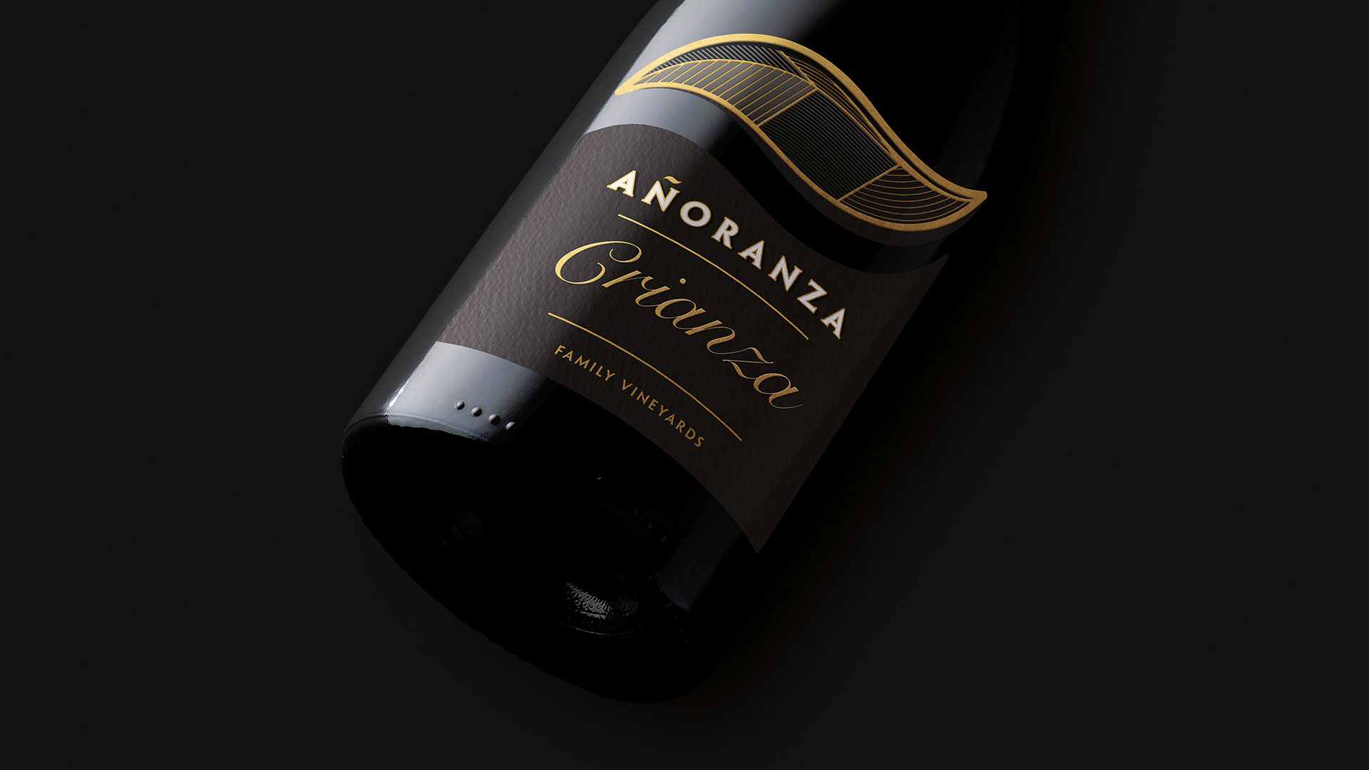
This range of six wines, with a well-established track record in the US export market, required a comprehensive update to align with contemporary aesthetic codes without losing its essence. The challenge lay in modernising the graphics while preserving the central symbol that defines the family identity.
The new graphic concept introduces geometric shapes inspired by the topography and layout of the vineyards, creating a balanced and modern visual structure. To elevate the perception of quality, the labels feature spot UV varnishes and embossing, adding a tactile, premium dimension to the overall presentation. This redesign was complemented by the selection of a new bottle, achieving a more contemporary and high-end aesthetic.
The result is a striking, avant-garde packaging design that reinforces the brand’s positioning on the shelf, ensuring a powerful and unified visual identity for the entire wine family.