The Piton Shandy
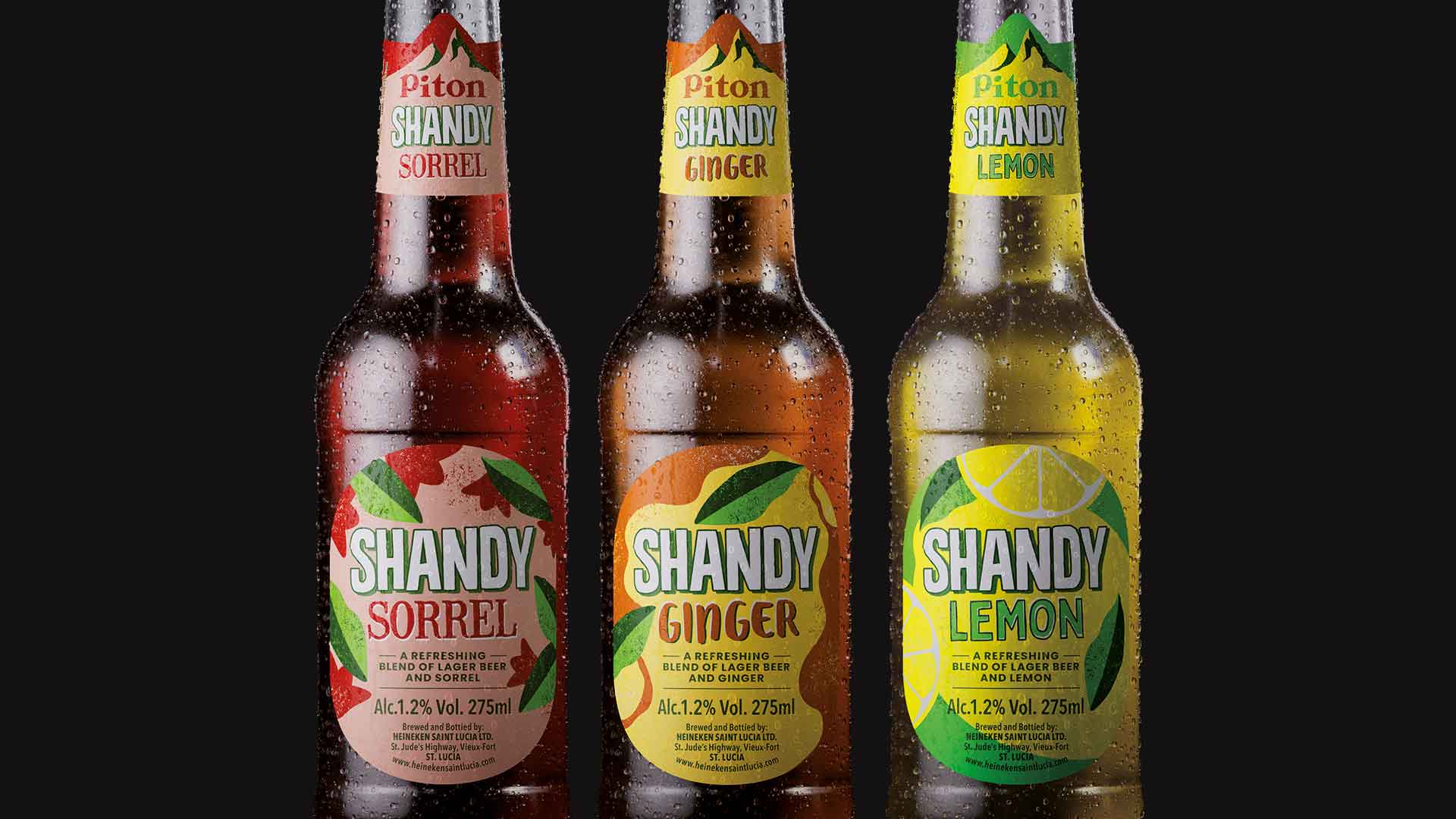
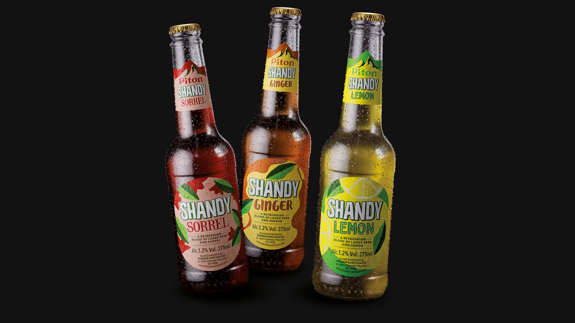
The Piton Shandy range required a bold redesign to capture the vibrant essence of Saint Lucia. The objective was to create a visual identity that not only communicated product freshness but also became a benchmark for dynamism and joy within the beverage sector.
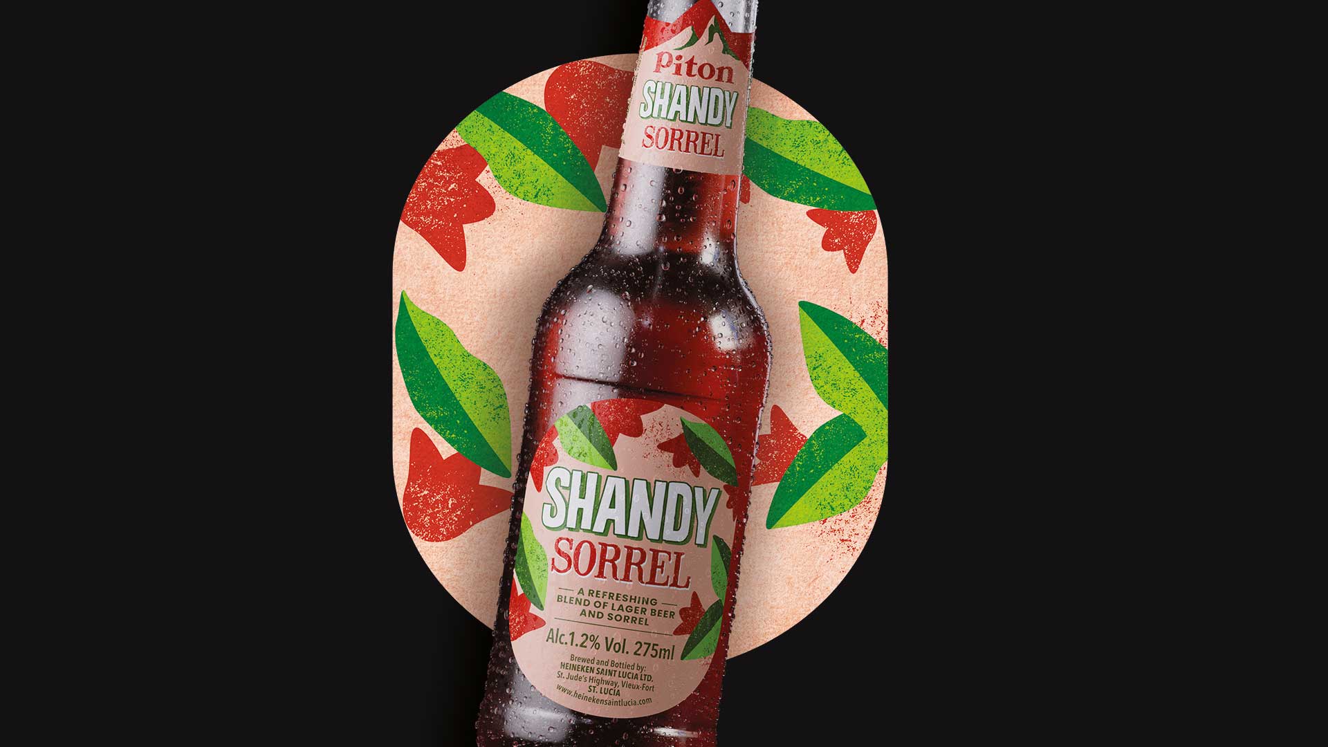
Our graphic solution relies on bespoke fruit illustrations, where colour and a laid-back linework take centre stage. We combined a high-intensity colour palette with a playful typography full of character, achieving packaging bursting with life that connects instantly with the consumer. This approach seeks to convey a complete sensory experience, where Caribbean energy is perceived from the very first visual contact.
The artistic quality of the project has been recognised by the industry, resulting in its selection for the 2025 CLAP Awards in the category of best illustration applied to packaging.