Kronos
Kronos entrusted us with the redesign of its brand identity at a pivotal moment in its expansion. Given its growing presence at events and food trucks, the restaurant required a more professional and coherent image to consolidate its visibility strategy without losing its original essence.
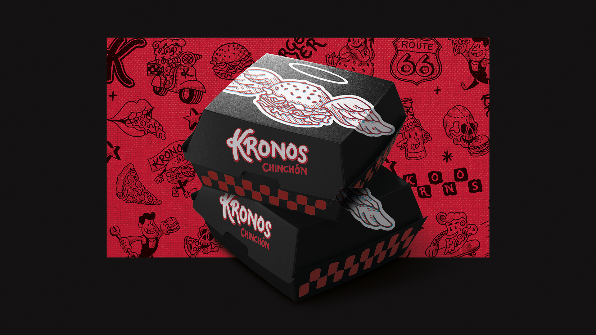
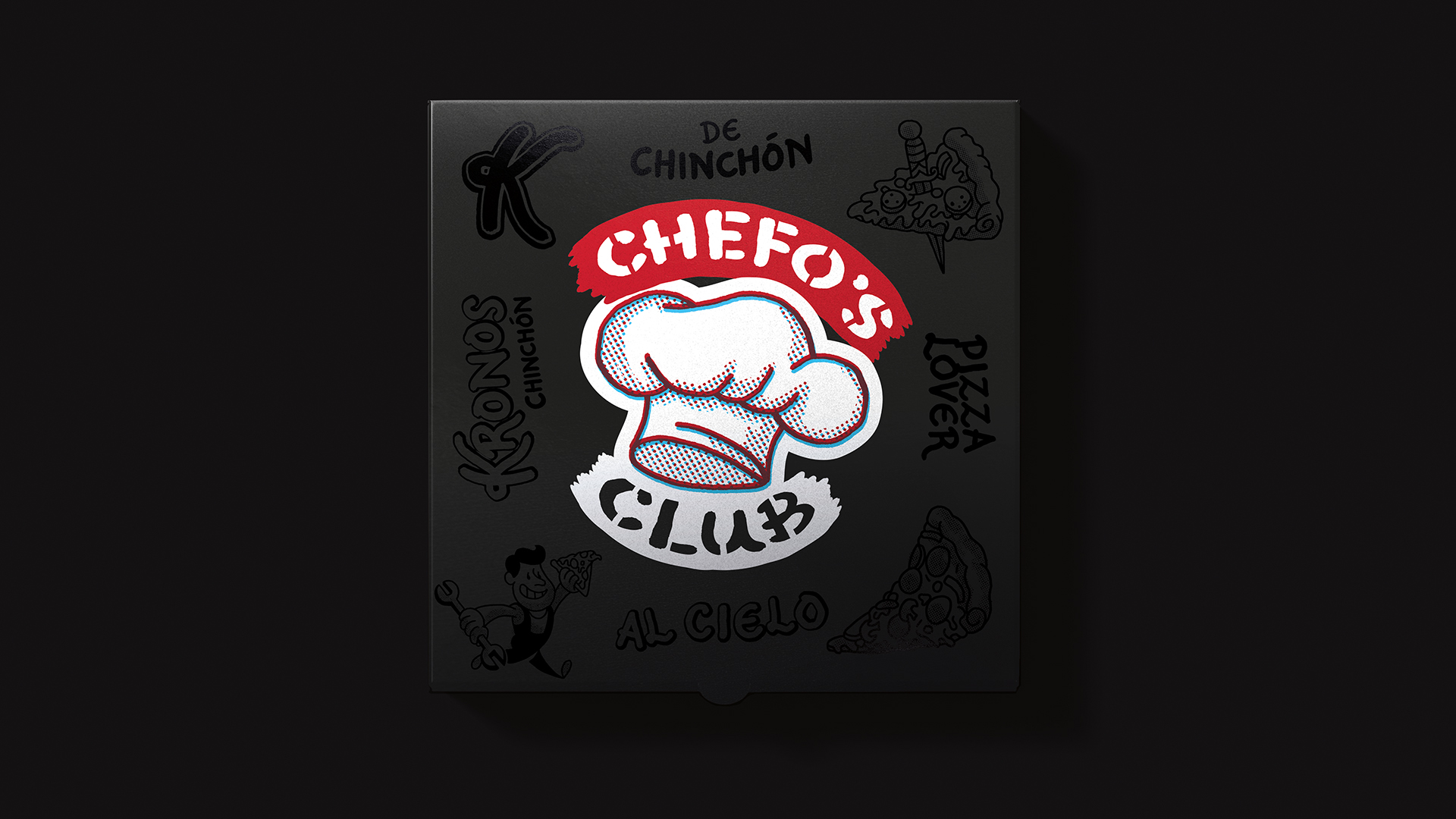
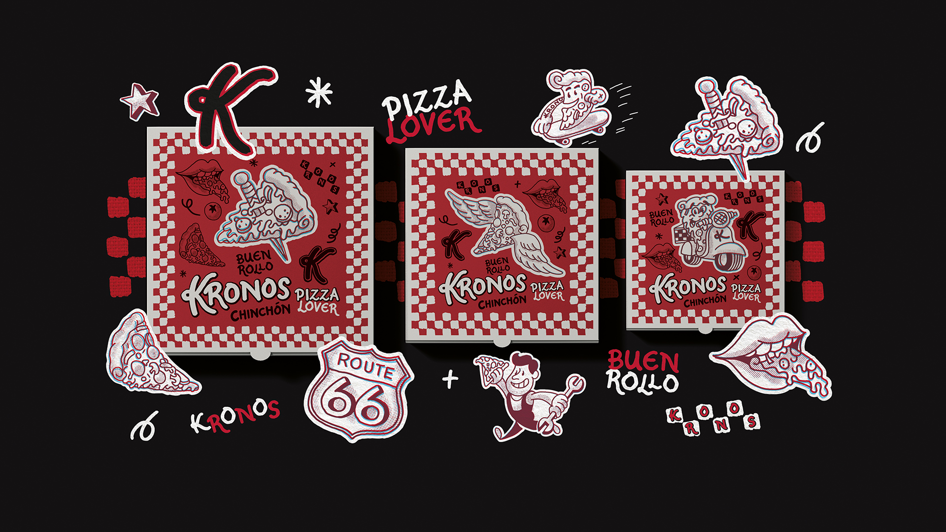
Our creative process began with the illustrations found within their premises, to which we breathed new life through a retro, laid-back reinterpretation. Drawing inspiration from classic American diner signage, we developed a fun and dynamic graphic universe. The choice of a red and black colour palette provides the necessary visual strength to elevate the brand’s positioning, transforming Kronos into a proposition with a distinct gourmet identity.
The result is a versatile, high-impact branding system designed to perform successfully in both the physical restaurant space and mobile formats, ensuring the brand is recognised and remembered in any environment.