Pancota
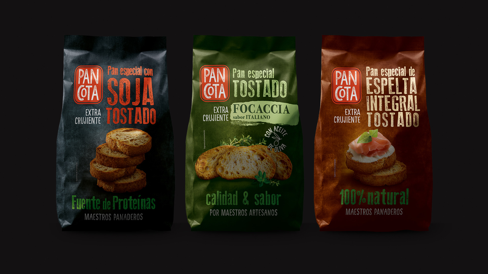
Our work began with a rebranding of the corporate identity, starting with the logo and establishing a renewed visual direction for the brand. From there, we moved on to the packaging, creating a design that feels fresh and contemporary while retaining the recognisable red and black colour palette of the original packs — an important element of Pancota’s existing identity.
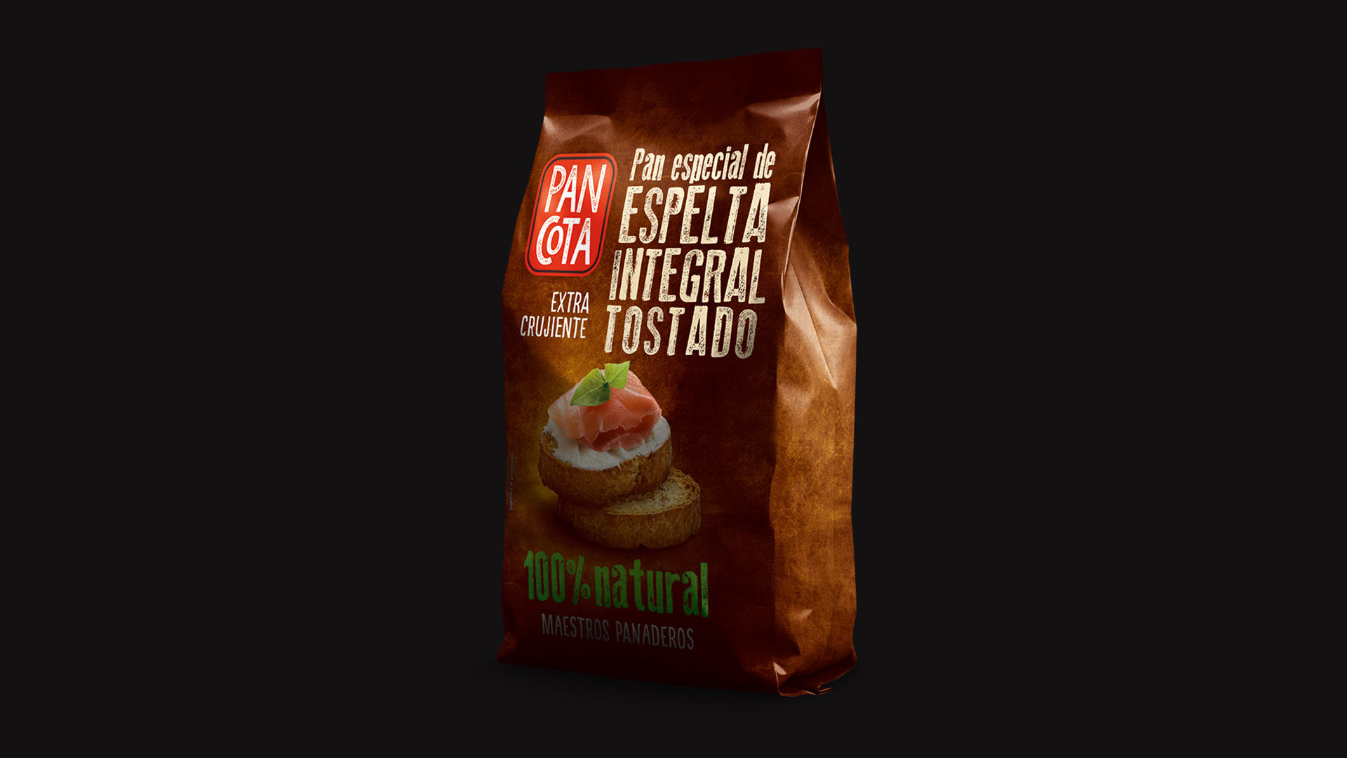
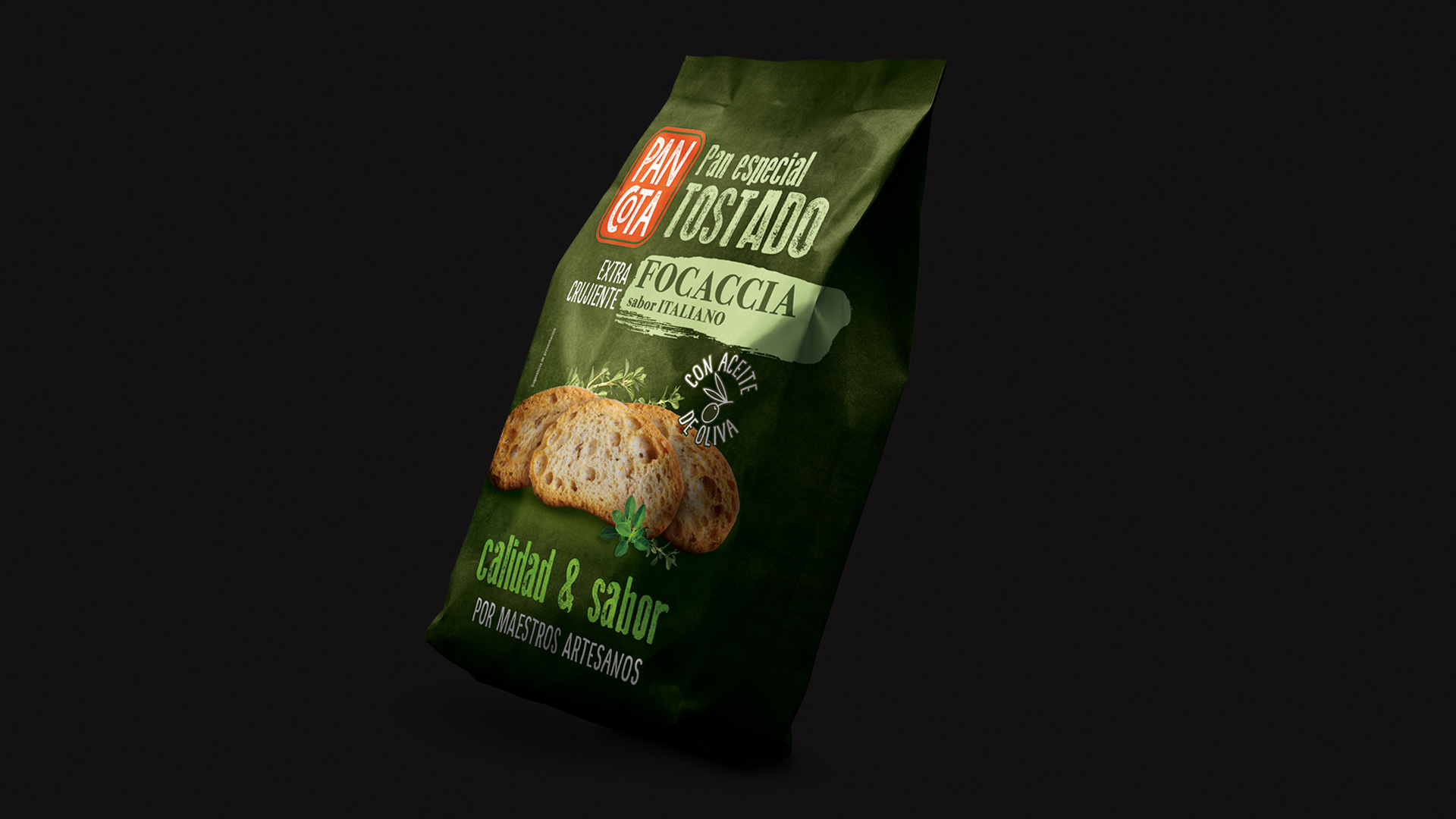
The result is a bold, confident packaging design that gives the products a strong presence on the shelf. Generously sized bags, finished with beautiful matte printing, bring a premium feel to the range while allowing the visual identity to shine.
As the brand has grown, so has the collection. Alongside the original Tostadas de Soja, we have introduced two new varieties: Tostadas de Espelta and Tostadas con Hierbas Estilo Italiano. Each new flavour builds on the established design system, creating a cohesive family of products while giving every variety its own personality.
With more flavours to come, the project continues to evolve — bringing together brand recognition, thoughtful design and a product promise that is simple at heart: healthy, functional and delicious.